


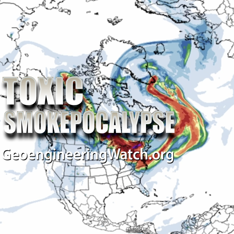


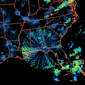


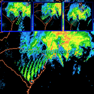


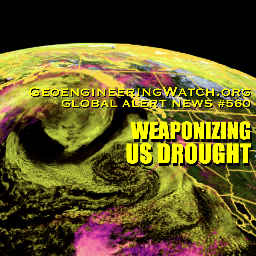
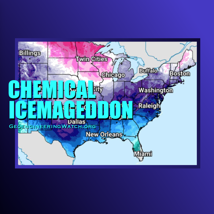
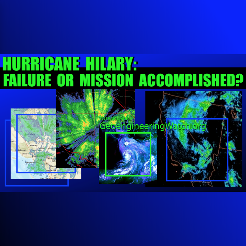
This map is as unnatural and historically unprecedented as they get, but now it has become the norm. Each color shade represents up to a three degree temperature range. As the map below makes clear, this means that the West may be 15 degrees above normal or more, and the East may be nearly the same below normal. While the population goes about business as usual as if nothing is wrong, the weather makers are burning the West to the ground. The engineered heat and drought in the West are so severe, recent studies indicate nothing like this has happened in at least 2000 years and even that statement is likely conservative. Is the unprecedented nature of the record warm West and record cold East being acknowledge by official agencies? Yes, the NOAA article further down this page admits to this fact as it is impossible to hide. It is important to remember that NOAA is little more than a branch of private defense contractor Raytheon. Raytheon is a primary player in regard to climate engineering patents and programs. The geoengineers have global populations by the throat with their weather warfare machine of insanity. The highly toxic fall out from these programs is getting worse by the day also. We are all in a fight for life right here and right now, all are needed in this battle to bring climate engineering to a halt.
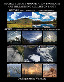
Dane Wigington
geoengineeringwatch.org

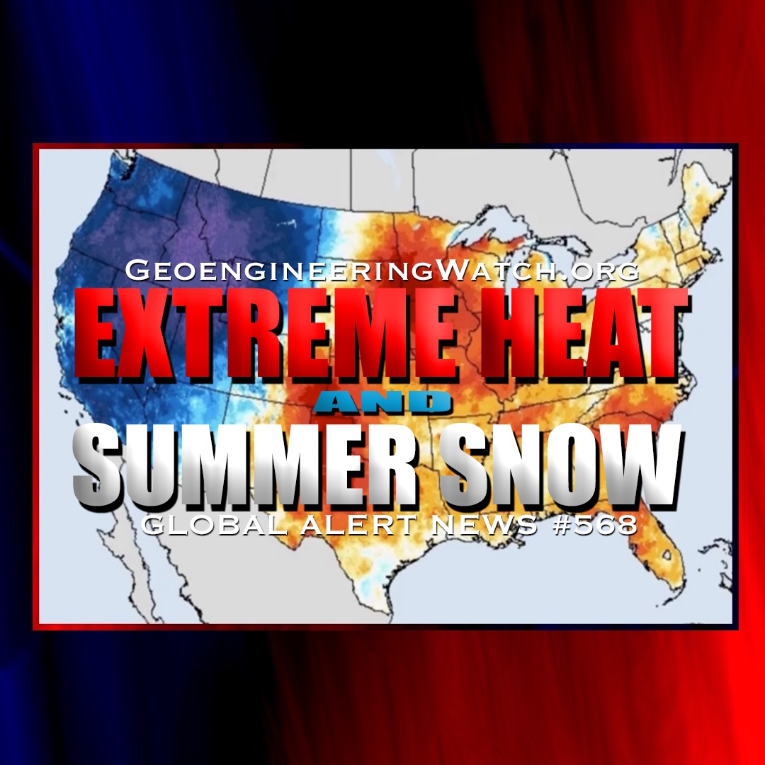
2014 temperature extremes: U.S. runs hot and cold
Source: Climate.gov
So far in 2014, much of the United States has been unusually cold. Not only that, but much of the United States has been unusually warm.
But wait, you say, you can’t have it both ways! Can you?
Typically, the answer to that question is no. But 2014 has not been typical. Never before have such large areas of the country experienced such radically different temperature extremes as they have so far this year. The map below shows just how divergent the temperature patterns have been across the contiguous United States for January-July 2014.
Minimum temperatures (“overnight lows”) for much of the Upper Midwest and the Mississippi Valley were much cooler than average—with a lone “record coldest” minimum temperature in Oklahoma—while a number of climate divisions across the Southwest, including drought-stricken California had record warm overnight lows.
The graph below shows January-July temperature extremes in a different way: the bars represent the percent of the country experiencing extremely warm or cold average maximum temperature (“daytime high”) during the first part of each year since 1910. For this analysis, an extreme means in the top or bottom 10% of the historical range of values recorded for a location.

Graph of percent U.S. area affected by extremes in maximum temperature (red is warm, blue is cool) in January-July 2014, based on data from the U.S. Climate Extremes Index (Step 1) from the National Climatic Data Center.
In most years in the record, extremes are significantly lopsided: a given year’s bar is mostly red or mostly blue, sometimes capped with a small segment of the opposite color. In other words, either some part of the country is experiencing warm extremes or cold extremes, but not both. Only a handful of years have a pattern similar to 2014—in which more than 10 percent of the country was experiencing extreme warmth while a similarly large or larger area experienced extreme coolness. Can you spot them all?
Even among these years, 2014 is unprecedented: never before has the country experienced such large areas of simultaneous, opposing temperature extremes in the same January-July period. At a combined 40% of the country, the area affected by extremes so far this year is nearly double the size you’d expect due to chance.
(As an aside, also notice how the graph becomes skewed toward warm extremes in more recent decades: this is yet another metric for how climate is changing.)
In an upcoming post, we will explore some of the weather and climate patterns behind the usually extreme U.S. temperatures.
Source: Climate.gov


4 Responses
There is a huge wildfire in Placerville CA. Today, a brief but heavy and unforeseen downpour occurred. HAARP…catch up to the Chinese America…
Thanks Dane!
Our weather maps never used to look like this! I get so tired of people giving me that look. Desensitizing bit by bit. After awhile, one does not know what is real or not real. Not giving up!
Dane: You ROCK! Thank you for your tireless efforts of bringing this very important issue of GeoEngineering to the front and center for all to clearly see. You have our continued support and dedication to assisting you in raising awareness!